Storytelling by Data Visualization
- Ana Barrera

- Nov 9, 2019
- 1 min read
To tell a great story, you sometimes don’t need words to say it. Using data-driven results can tell a more compelling story. In business, using data visualization will help with the narrative of your story.
Here are some data visualizations that you can use to tell a better business story:
Bar Charts
Pie Charts
Tables
Line Graphs
Maps
Infographics
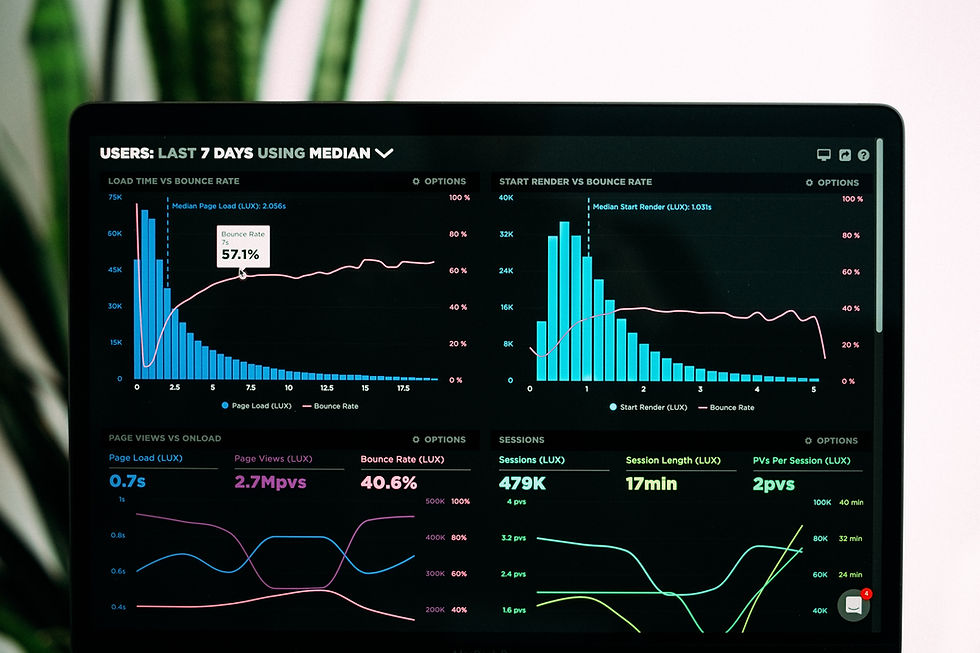
Dashboards
Data visualization is a graphical illustration of information and data. By using graphical elements like these, it provides a bigger picture of what you are telling regarding the business at hand.
Depending on what you want to present, you can choose the type of visualization you want to use. Here are the four most common:
Nominal comparison: associate sets of data in no particular order.
Ranking: arranges and orders your data points using a precise measurement.
Time-series: categorizes data points by time.
Part-to-whole: looks at how separate data points relate to each other as part of the whole data set.
Today, there are many tools available at your fingertips to create these illustrations of data.
Microsoft provides in all their application charts tools to create a column, pie, bar graphs, tables, and radar graphs. Apple provides a similar application called Numbers that lets you build charts and graphs. For a cost, there are online tools like Tableau, Fusion Chart, Highcharts, and Google Charts.


Comments